In this post I will demonstrate how I created my logo stage by stage.
1) First of all I created a circle using "Ellipse Tool". Then I created another "Layer" and started tracing greenery part by "Pen Tool" and "Convert Anchor Point Tool". then I filled in the outline with Gradient Green Color.

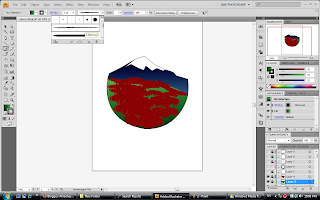
2) Next, I added another layer and drew a mountain and snow using "Pen Tool" once more.
then I painted the foot of the mountain with "Paintbrush Tool" changing its type into "Charcoal"
and size of 10pt.
3) In following step, I drew a big circle using "Ellipse Tool", and holding "Ctr+C+F", I duplicated another circle with same size; then I changed the second circle's size a bit larger than the first one by right clicking and choosing "Scale" from "Transform" menu. Further, I applied "Pathfinder Tool of Exclude".
then I painted the foot of the mountain with "Paintbrush Tool" changing its type into "Charcoal"
and size of 10pt.

3) In following step, I drew a big circle using "Ellipse Tool", and holding "Ctr+C+F", I duplicated another circle with same size; then I changed the second circle's size a bit larger than the first one by right clicking and choosing "Scale" from "Transform" menu. Further, I applied "Pathfinder Tool of Exclude".

4) Same as the last part, I followed the same rules to create a smaller circular frame but the coloring part, I changed the place of "Black and White" in Gradient coloring.

5) Then I overlapped the smaller frame onto the bigger one like bellow:

6) I added some shapes as for the lens to make it more realistic. to make make it more transparent I changed their opacity to 77% and their Blending Mode into "Overly".

7) Finally, I added some text using "Type on path Tool" to mount on the circular shape. And Done!!!!


No comments:
Post a Comment